开始 🚀
我这里使用 vue3 实现瀑布流+虚拟列表,实现效果可以看这里。
什么是瀑布流?🌊
什么是瀑布流,瀑布流是一种常用于展示不等高内容块的网页布局方式,其特点是:
从上往下填充,优先放到当前最短的那一列。
像下面小红书这样

css 实现 🎨
首先纯 css 就可以实现类似上面的效果,如下面的代码
<div class="p-10 columns-3 lg:columns-5">
  <div class="h-[100px] bg-red-100 break-inside-avoid mb-4">1</div>
  <div class="h-[120px] bg-blue-100 break-inside-avoid mb-4">2</div>
  <div class="h-[50px] bg-slate-200 break-inside-avoid mb-4">3</div>
  <div class="h-[90px] bg-orange-200 break-inside-avoid mb-4">4</div>
  <div class="h-[40px] bg-yellow-100 break-inside-avoid mb-4">5</div>
  <div class="h-[180px] bg-pink-100 break-inside-avoid mb-4">6</div>
  <div class="h-[180px] bg-gray-100 break-inside-avoid mb-4">7</div>
</div>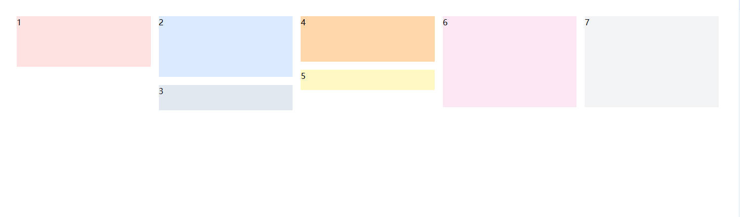
这种方式虽然简单直观,但它是“列优先”填充,而不是我们预期中的“高度最短列优先”。所以当我们需要更精准控制(比如配合虚拟列表)时,CSS 方式就不太够用了。🙅♂️
js 实现 🧩
我们通过 JavaScript 来实现更灵活、可控的瀑布流布局。核心逻辑:
- 获取容器宽度,计算每个卡片宽度;
- 通过响应式断点适配不同列数;
- 根据图片宽高比 & 文本内容动态计算卡片高度;
- 每张卡片插入当前“最短”的列中;
- 用
transform进行绝对定位,性能更优;
布局
布局我们分为容器,列表,列表项三个部分
<div
  class="waterfall-container w-full h-full overflow-x-hidden overflow-y-auto"
>
  <div class="waterfall-list relative">
    <div
      class="waterfall-item absolute top-0 left-0 transition-transform duration-300 overflow-hidden will-change-transform"
    >
      <slot :item="item"></slot>
    </div>
  </div>
</div>
TIP
container 部分要设置超出滚动,子项通过绝对定位统一在左上角,后面通过 translate3d 来实现偏移,再设置插槽来显示内容。
参数定义
- 因为我们是封装的组件,所以要配置一些参数让用户传入。
interface IItem {
  id: number;
  url: string;
  date: Record<string, any>;
  frontmatter: Record<string, any>;
}
interface IBreakpoint {
  [key: string]: {
    columns: number;
    gap: number;
  };
}
const props = defineProps<{
  list: IItem[];
  gap: number;
  columns: number;
  breakPoint?: IBreakpoint;
}>();
TIP
list 是列表数据,这里的 id 要设置列表的索引值,后面取数据时要用到。gap 是列表项之间的间距,columns 是列数,breakPoint 是响应式的配置,当屏幕宽度小于某个值时,列数会改变。
- 然后是定义一些变量,用来存储卡片的数据和每一列的高度。
interface ICardPosition {
  imageHeight: number;
  width: number;
  height: number;
  x: number;
  y: number;
}
const state = reactive({
  cardWidth: 0,
  cardPosition: [] as ICardPosition[],
  columnHeight: [] as number[],
});
TIP
cardWidth 是卡片的宽度,cardPosition 存储这卡片的图片高度,卡片宽高和 x,y 的偏移量,columnHeight 是每一列的高度。
获取列数和间距
因为我们是响应式的,所以要根据屏幕宽度来获取用户传入的正确的列数和间距。
const breakPoint = {
  560: {
    columns: 3,
    gap: 10,
  },
  1024: {
    columns: 4,
    gap: 20,
  },
  1280: {
    columns: 5,
    gap: 20,
  },
};
通过循环判断获取正确的列数和间距。
const realColumnsAndGap = reactive({
  columns: props.columns,
  gap: props.gap,
});
const calculateColumnsAndGap = () => {
  const breakpoints = props.breakPoint;
  const windowWidth = window.innerWidth;
  let matched = {
    columns: props.columns,
    gap: props.gap,
  };
  let maxMatchedWidth = -1;
  if (breakpoints) {
    Object.keys(breakpoints).forEach((bp) => {
      const bpNum = Number(bp);
      if (windowWidth >= bpNum && bpNum > maxMatchedWidth) {
        maxMatchedWidth = bpNum;
        matched = breakpoints[bpNum];
      }
    });
  }
  if (matched) {
    realColumnsAndGap.columns = matched.columns;
    realColumnsAndGap.gap = matched.gap;
  } else {
    realColumnsAndGap.columns = props.columns;
    realColumnsAndGap.gap = props.gap;
  }
};
如果没传响应式配置则用默认的 columns 和 gap。
计算卡片的宽度
获取到列数和间距后,就可以通过容器的宽度来计算卡片的宽度了。
这里我们定义个 ref 绑定 container
const containerRef = ref<HTMLDivElement | null>(null);
const calculateCardWidth = () => {
  if (!containerRef.value) return;
  const containerWidth = containerRef.value.clientWidth;
  state.cardWidth =
    (containerWidth - realColumnsAndGap.gap * (realColumnsAndGap.columns - 1)) /
    realColumnsAndGap.columns;
};
TIP
gap 的数量是 columns - 1
计算图片高度
这里的图片宽高信息要通过后端返回,不然只能通过前端预加载来获取,但是对于图片多的来说,这样非常耗时间。
const calculateCardImageHeight = () => {
  list.value.forEach((item, index) => {
    if (!item.frontmatter.pic) return;
    const [width, height] = item.frontmatter.picSize.split("x");
    const imageHeight = Math.floor((state.cardWidth * height) / width);
    state.cardPosition[index] = {
      ...state.cardPosition[index],
      imageHeight,
    };
  });
};
计算卡片高度
首先我们分析下小红书的布局,分为图片、标题、和作者信息。
这里图片的高度我们知道了,作者信息的高度通过元素选择我们可以看到是固定的 20px,所以我们只需要计算标题的高度就可以了。
小红书这里标题分为一行跟两行,我们通过 canvas 的 measureText 可以获取文本的宽度,我们可以拿到这个宽度跟卡片的宽度比较,如果超过卡片的宽度就表示文本会换行显示,直接取两行的高度即可。
我的文章列表也类似小红书的布局,分为图片、标题、简介和发布时间。

内容区域的边距,标题高度,发布时间高度是固定的,一行简介跟两行简介的高度也是固定的,所以我们可以先定义好变量。
const padding = 24;
const titleHeight = 20;
const oneRowContent = 22;
const twoRowContent = 38;
const timeHeight = 28;
首先定义一个隐藏的 canvas,用来测量文本的宽度
<canvas id="canvas" ref="canvasRef" class="hidden"></canvas>接着就可以计算文本宽度
const canvasRef = ref<HTMLCanvasElement | null>(null);
const getTextWidth = (text: string) => {
  if (!canvasRef.value || !containerRef.value) return 0;
  const ctx = canvasRef.value.getContext("2d");
  if (!ctx) return 0;
  const style = getComputedStyle(containerRef.value);
  ctx.font = `12px ${style.fontFamily}`;
  const canvasText = ctx.measureText(text);
  return canvasText.width;
};
TIP
这里需要注意设置 canvas 的字体样式,我的标题是用的 12px 的字体大小,字体用的默认字体。
获取卡片高度
const getCardHeight = () => {
  list.value.forEach((item, index) => {
    const padding = 24;
    const titleHeight = 20;
    const oneRowContent = 22;
    const twoRowContent = 38;
    const timeHeight = 28;
    const contentWidth = getTextWidth(item.frontmatter.desc);
    const contentHeight =
      contentWidth > state.cardWidth - 16 ? twoRowContent : oneRowContent;
    const cardHeight =
      padding +
      titleHeight +
      contentHeight +
      timeHeight +
      state.cardPosition[index].imageHeight;
  });
};
获取到卡片的高度信息后,我们需要将信息添加到上面定义的 state.cardPosition 中,同时将信息加入 state.columnHeight 中,方便后面计算卡片的位置。 我们知道瀑布流的布局第一排都是在最顶上,从第二排开始,每个卡片在插入时,要插入最小高度的那一列中,所以我们分两种情况。
- 第一排时
if (index < realColumnsAndGap.columns) {
  state.cardPosition[index] = {
    ...state.cardPosition[index],
    width: state.cardWidth,
    height: cardHeight,
    x:
      index % realColumnsAndGap.columns === 0
        ? 0
        : index * (state.cardWidth + realColumnsAndGap.gap),
    y: 0,
  };
  state.columnHeight[index] = cardHeight + realColumnsAndGap.gap;
}
TIP
当是最左边一个的时候,x 的值为 0,否则为当前列数乘以卡片宽度加上间距。
- 不是第一排 不是第一排的时候我们要获取最小高度的列和对应的索引值。因为后面需要将高度最大的那一列的值绑定到列表的高度上,所以这里我们定义一个用来获取最大和最小高度列的函数。
const columnStats = computed(() => {
  let minIndex = -1;
  let minHeight = 0;
  let maxHeight = 0;

  state.columnHeight.forEach((height, index) => {
    // 处理最小值
    if (minIndex === -1 || height < minHeight) {
      minIndex = index;
      minHeight = height;
    }

    // 处理最大值
    if (height > maxHeight) {
      maxHeight = height;
    }
  });

  return {
    minIndex,
    minHeight,
    maxHeight,
  };
});
用获取到的最小高度列的索引值来替换 index,和 y。
const { minIndex, minHeight } = columnStats.value;
state.cardPosition[index] = {
  ...state.cardPosition[index],
  width: state.cardWidth,
  height: cardHeight,
  x: minIndex * (state.cardWidth + realColumnsAndGap.gap),
  y: minHeight,
};
state.columnHeight[minIndex] += cardHeight + realColumnsAndGap.gap;
完整的获取卡片高度的代码如下
const getCardHeight = () => {
  list.value.forEach((item, index) => {
    const padding = 24;
    const titleHeight = 20;
    const oneRowContent = 22;
    const twoRowContent = 38;
    const timeHeight = 28;
    const contentWidth = getTextWidth(item.frontmatter.desc);
    const contentHeight =
      contentWidth > state.cardWidth - 16 ? twoRowContent : oneRowContent;
    const cardHeight =
      padding +
      titleHeight +
      contentHeight +
      timeHeight +
      state.cardPosition[index].imageHeight;

    if (index < realColumnsAndGap.columns) {
      state.cardPosition[index] = {
        ...state.cardPosition[index],
        width: state.cardWidth,
        height: cardHeight,
        x:
          index % realColumnsAndGap.columns === 0
            ? 0
            : index * (state.cardWidth + realColumnsAndGap.gap),
        y: 0,
      };
      state.columnHeight[index] = cardHeight + realColumnsAndGap.gap;
    } else {
      const { minIndex, minHeight } = columnStats.value;
      state.cardPosition[index] = {
        ...state.cardPosition[index],
        width: state.cardWidth,
        height: cardHeight,
        x: minIndex * (state.cardWidth + realColumnsAndGap.gap),
        y: minHeight,
      };
      state.columnHeight[minIndex] += cardHeight + realColumnsAndGap.gap;
    }
  });
};
最后我们将上面的方法整合进 init 中统一执行,再加监听下 container 的宽度变化,来实现响应式。
const init = () => {
  // 1.初始化
  state.cardWidth = 0;
  state.cardPosition = [];
  state.columnHeight = [];
  // 2.计算列数和间距
  calculateColumnsAndGap();
  // 3.根据容器宽度、列数和间距,计算卡片宽度
  calculateCardWidth();
  // 4.计算图片高度
  calculateCardImageHeight();
  // 5.计算卡片高度
  getCardHeight();
};
我们用 ResizeObserver 来监听容器宽度的变化。
// 因为宽度变化是很频繁的,我们封装一个防抖来优化下
const debounce = (fn, delay, immediate = false) => {
  let timer;
  return function (...args) {
    const context = this;
    if (timer) clearTimeout(timer);

    if (immediate && !timer) {
      fn.apply(context, args);
    }

    timer = setTimeout(() => {
      if (!immediate) fn.apply(context, args);
      timer = null;
    }, delay);
  };
};
const debounceInit = debounce(init, 500);
const resizeObserver = new ResizeObserver(() => {
  debounceInit();
});
在 onMounted 中执行。
onMounted(async () => {
  if (!containerRef.value) return;
  init();
  resizeObserver.observe(containerRef.value);
});
onUnmounted(() => {
  containerRef.value && resizeObserver.unobserve(containerRef.value);
});
最后通过 v-for 渲染,绑定下样式。
<canvas id="canvas" ref="canvasRef" class="hidden"></canvas>
<div
  class="waterfall-container w-full h-full overflow-x-hidden overflow-y-auto"
  ref="containerRef"
>
  <div
    class="waterfall-list relative"
    ref="listRef"
    :style="{ height: columnStats.maxHeight + 'px' }"
  >
    <div
      class="waterfall-item absolute top-0 left-0 transition-transform duration-300 overflow-hidden will-change-transform"
      v-for="item in list"
      :key="item.id"
      :style="{
          width: `${state.cardWidth}px`,
          height: `${state.cardPosition[item.id]?.height}px`,
          transform: `translate3d(${state.cardPosition[item.id]?.x || 0}px, ${
            state.cardPosition[item.id]?.y || 0
          }px, 0)`,
        }"
    >
      <slot :item="item"></slot>
    </div>
  </div>
</div>
到这瀑布流的效果就做好了,可以来看看效果。

虚拟列表 👀
虚拟列表是一种性能优化技术,用于高效渲染大量数据项的滚动列表,常用于前端开发中。它的核心思想是:
只渲染可视区域内的元素,避免一次性将所有列表项都插入 DOM。

在前面实现瀑布流的时候获取了卡片的位置信息,所以我们结合容器的 scrollTop 和位置信息从 list 中筛选出可见的卡片数组进行渲染。
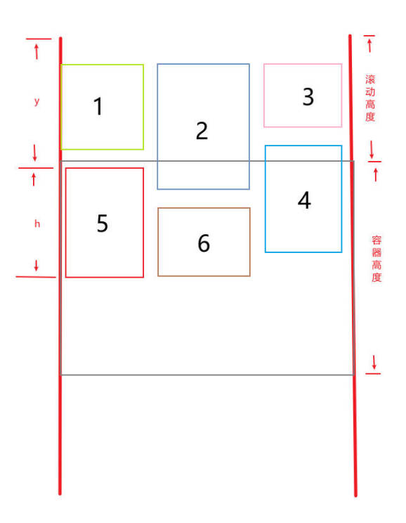
通过上面的图可以得出:
- 当卡片的高度 h + 卡片的 y 大于 容器的滚动高度时,该卡片在容器顶部的下方。
- 当卡片的 y 小于容器的滚动高度 + 容器高度时,该卡片在容器底部上方。
同时满足以上条件的卡片,即为可见的卡片。现在我们就来将满足这两个条件的卡片过滤出来。
同时加入一段缓冲区域,让滚动更丝滑(比如 buffer 高度是容器高度的 50%)。
const visibleCard = ref<IItem[]>([]);
const calculateVisibleCard = () => {
  const bufferHeight = containerRef.value
    ? containerRef.value.clientHeight * 0.5
    : 0;
  const arr = list.value.filter((_, index) => {
    if (state.cardPosition[index] && containerRef.value) {
      const h = state.cardPosition[index].height;
      const y = state.cardPosition[index].y;
      const scrollTop = containerRef.value.scrollTop;
      const viewportHeight = containerRef.value.clientHeight;
      return (
        y + h > scrollTop - bufferHeight &&
        y < scrollTop + viewportHeight + bufferHeight
      );
    }
  });
  visibleCard.value = arr;
};
再将这个方法绑定到滚动事件上,这里放到 requestAnimationFrame 中,来优化性能。
const throttleRAF = (fn) => {
  let running = false;
  return function () {
    if (running) return;
    running = true;
    requestAnimationFrame(() => {
      fn();
      running = false;
    });
  };
};
const throttledCalculateVisibleCard = throttleRAF(calculateVisibleCard);
最后 html 中添加滚动事件监听
<canvas id="canvas" ref="canvasRef" class="hidden"></canvas>
<div
  class="waterfall-container w-full h-full overflow-x-hidden overflow-y-auto"
  ref="containerRef"
  @scroll="throttledCalculateVisibleCard"
>
  <div
    class="waterfall-list relative"
    ref="listRef"
    :style="{ height: columnStats.maxHeight + 'px' }"
  >
    <div
      class="waterfall-item absolute top-0 left-0 transition-transform duration-300 overflow-hidden will-change-transform"
      v-for="item in visibleCard"
      :key="item.id"
      :style="{
          width: `${state.cardWidth}px`,
          height: `${state.cardPosition[item.id]?.height}px`,
          transform: `translate3d(${state.cardPosition[item.id]?.x || 0}px, ${
            state.cardPosition[item.id]?.y || 0
          }px, 0)`,
        }"
    >
      <div class="animate-box">
        <slot :item="item"></slot>
      </div>
    </div>
  </div>
</div>
这里嵌套了个 animate-box 的 div 用来添加渐入的动画效果。
.animate-box {
  animation: MoveAnimate 0.5s;
}
@keyframes MoveAnimate {
  from {
    opacity: 0;
    transform: translateY(200px);
  }
  to {
    opacity: 1;
    transform: translateY(0);
  }
}
最后实现的效果,注意右侧 dom 的变化。
